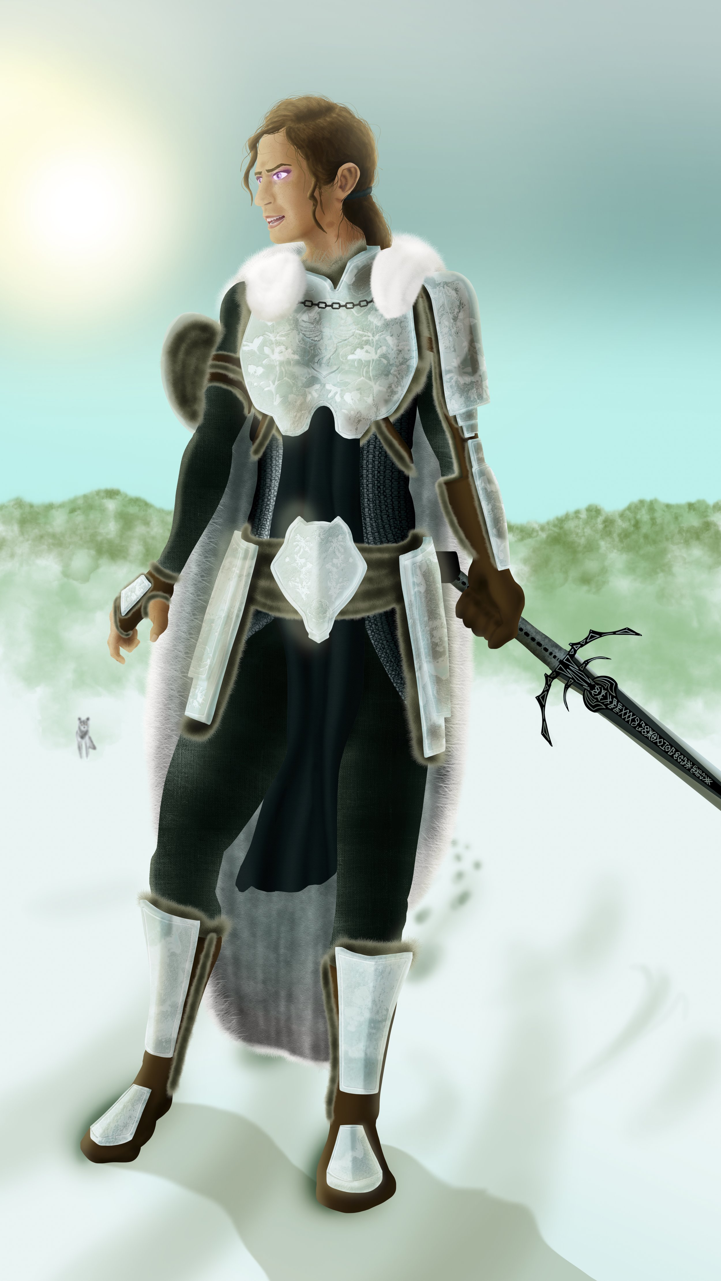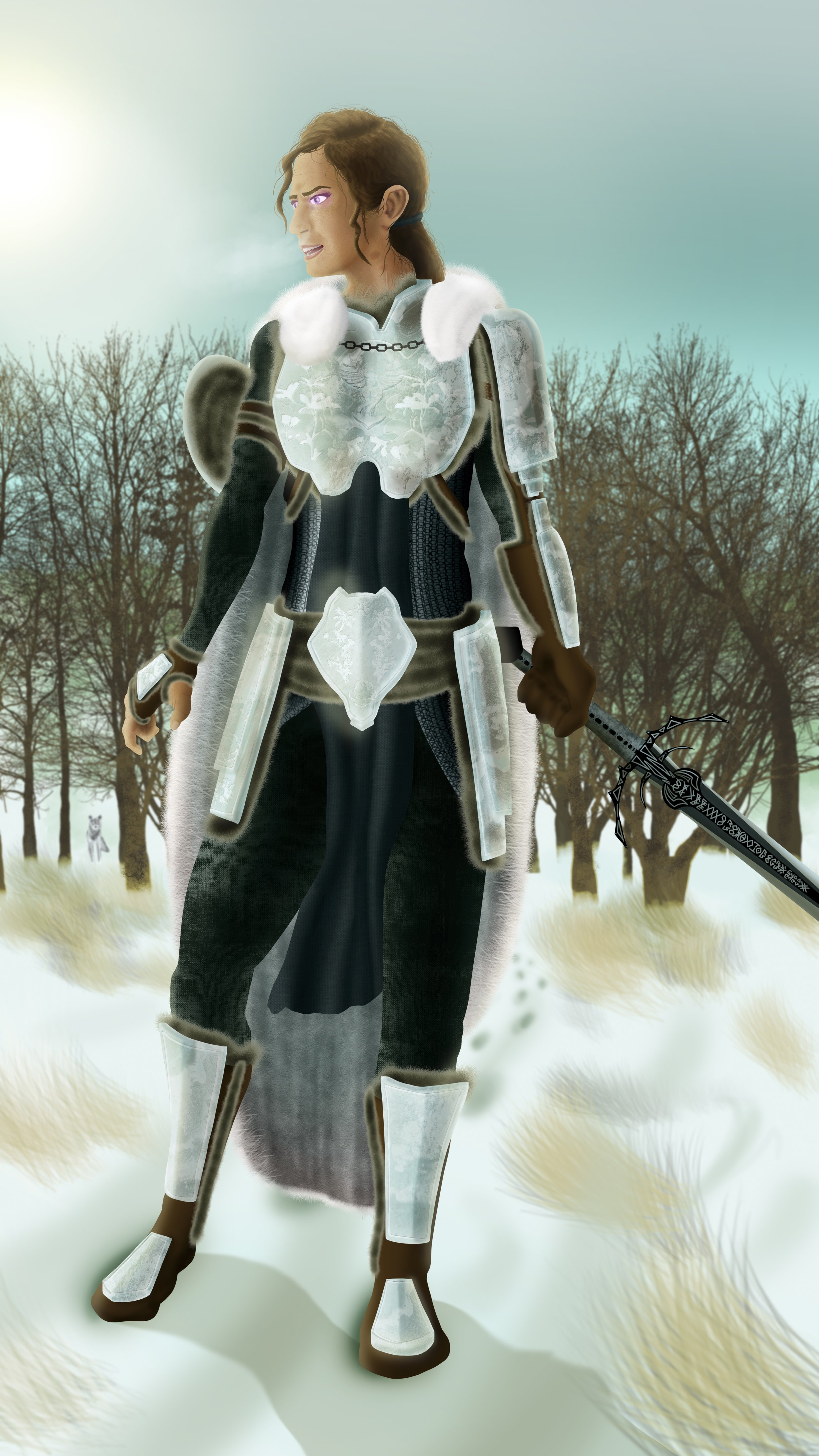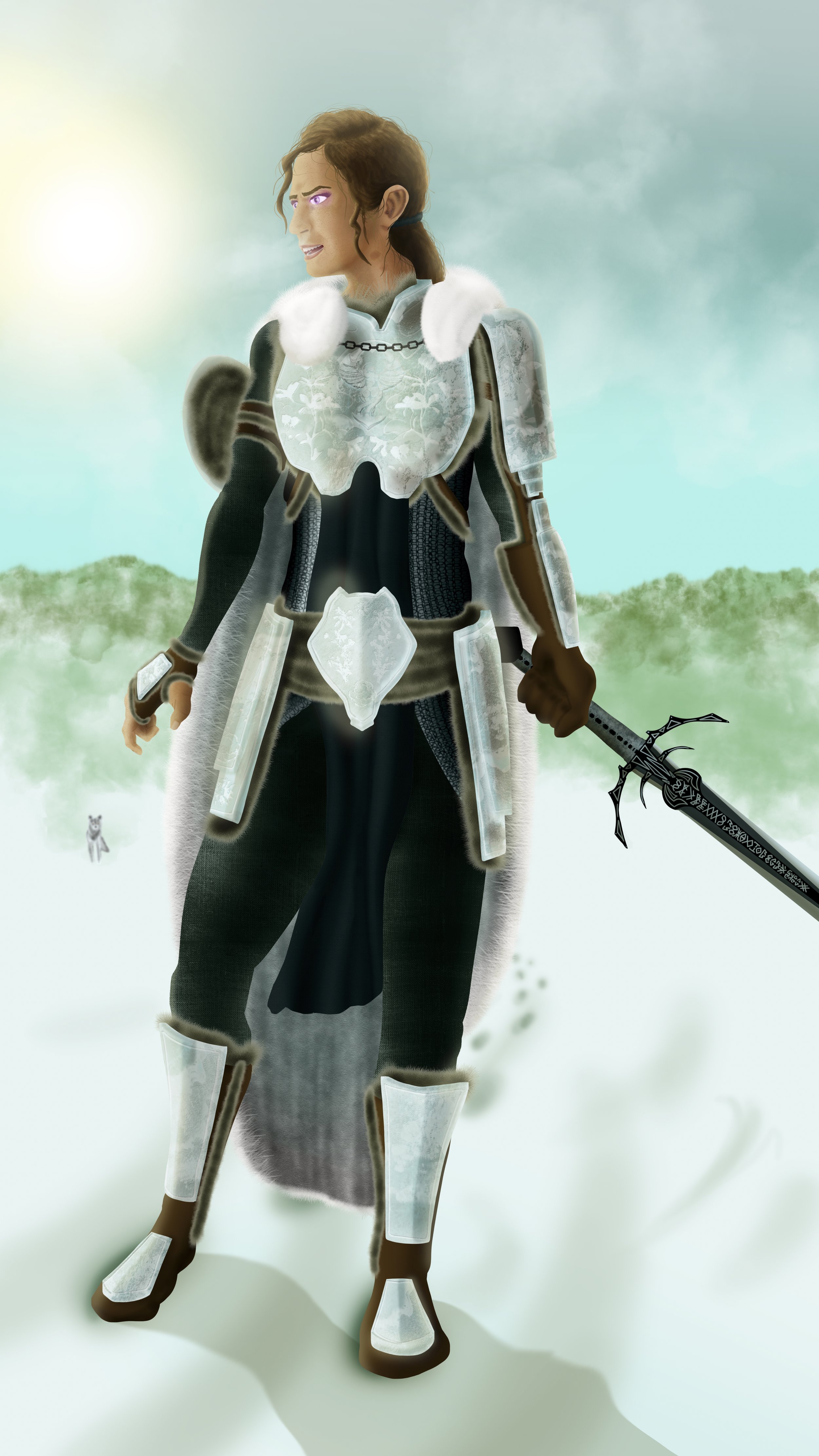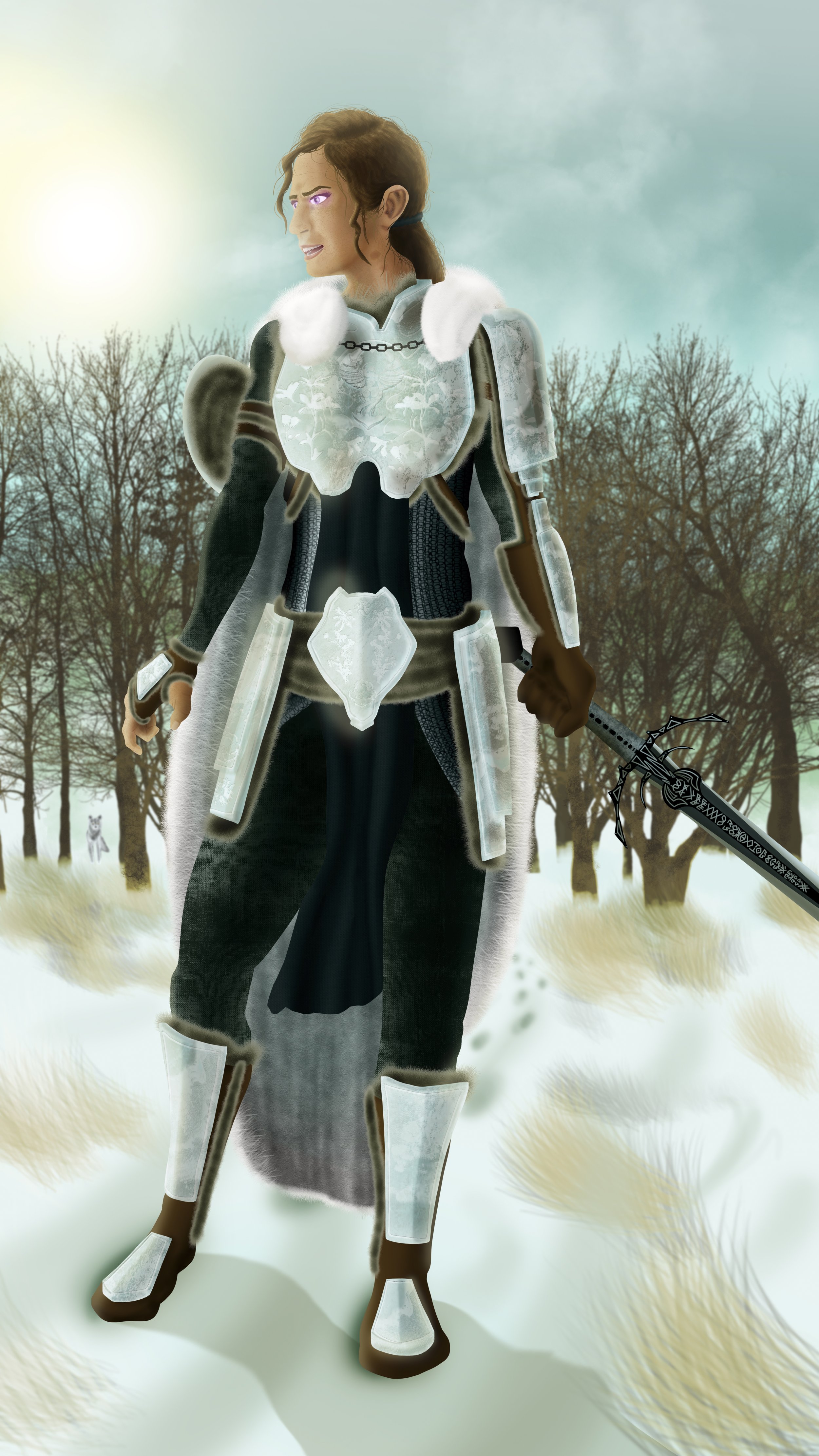
The Frame
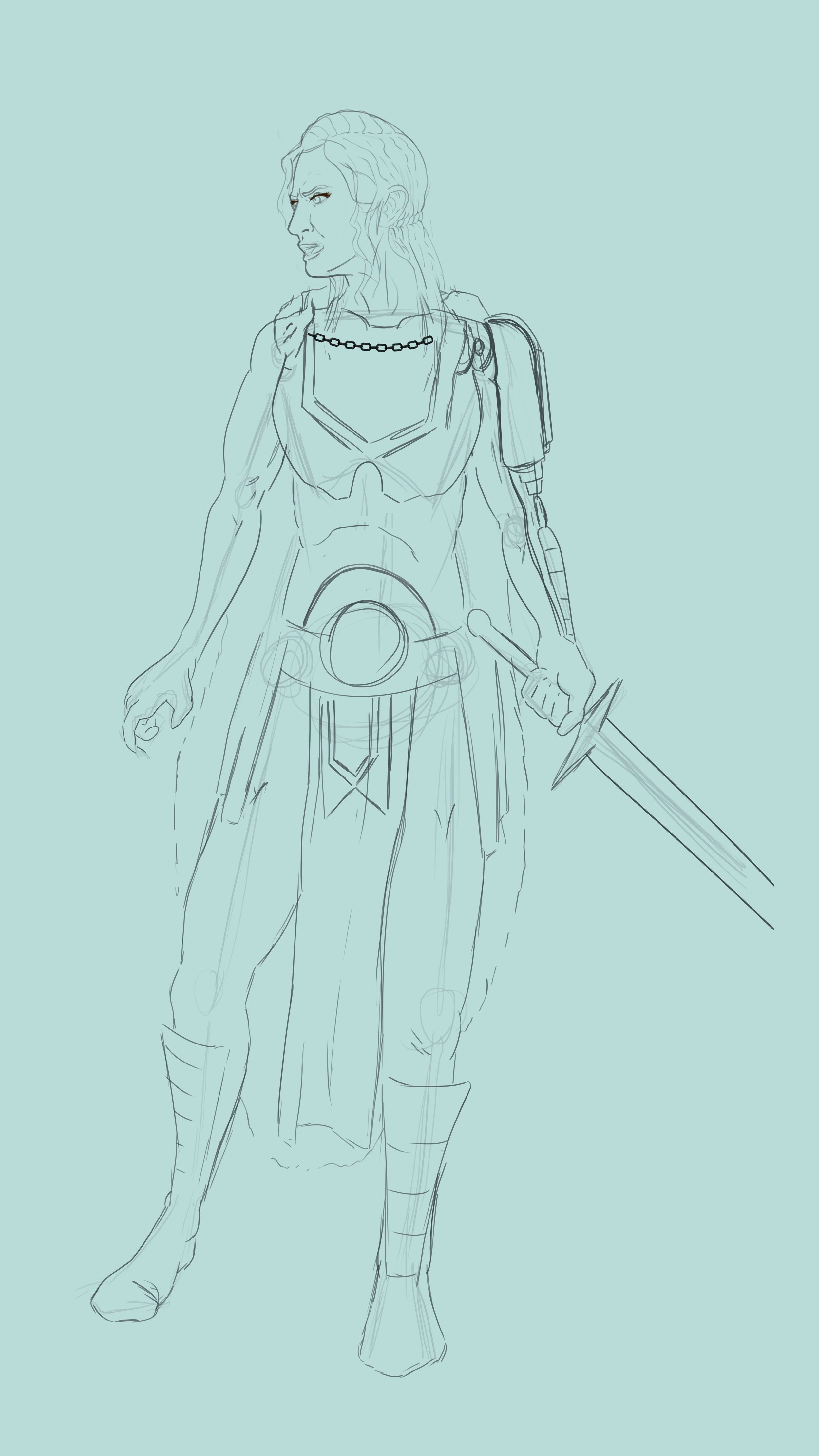
First I start off with the final draft sketch. Let’s start off with the basic expectations of iron-clad. Armor, and sword. A necessity for any battle-hardened hero.

Color Shaping
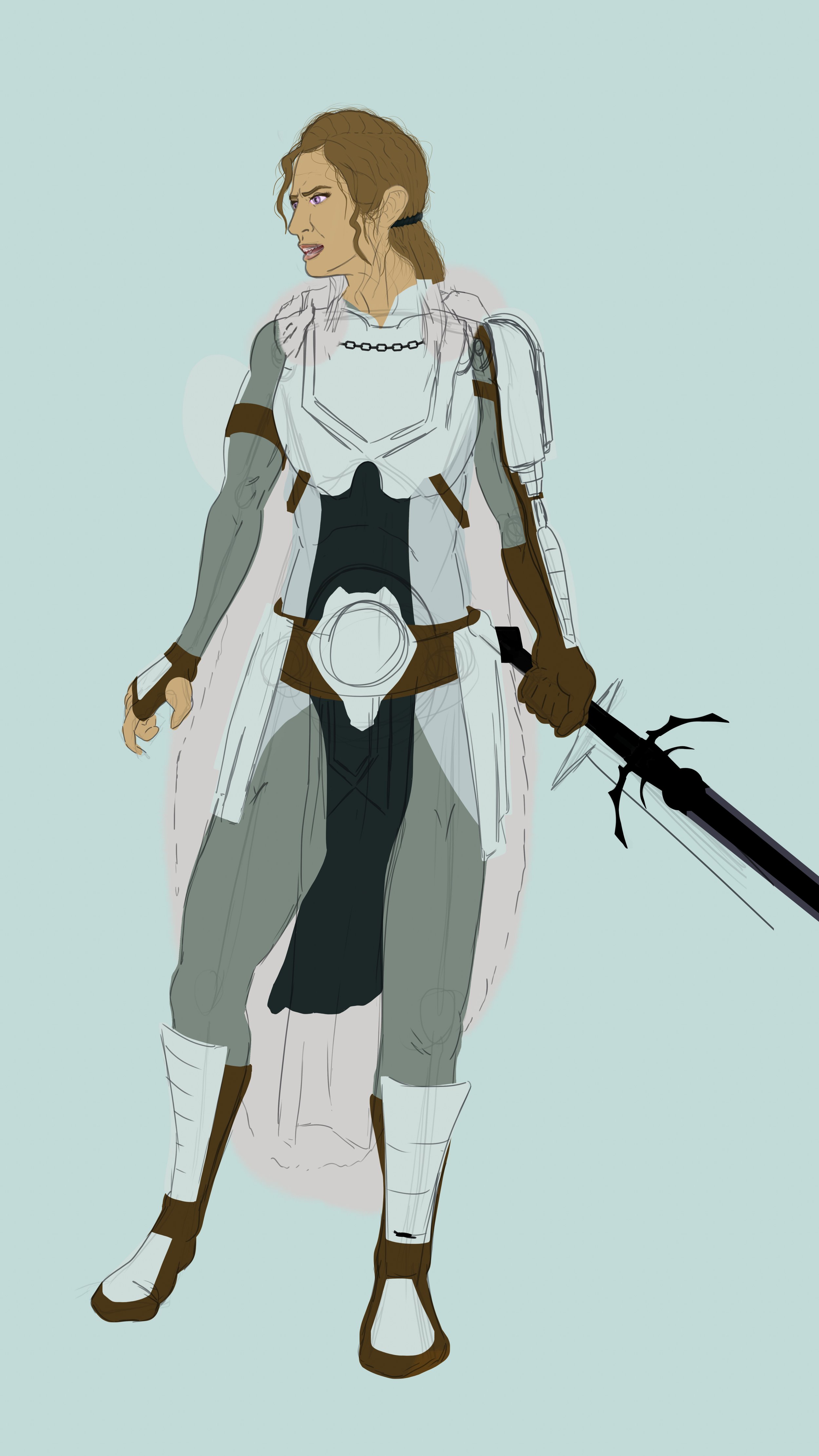
Next step is building the colored shapes that fill the interior lines. Orange and blue build complementary contrast, value can lead us further into lighter blues against darker browns and oranges.

Shape Refinement
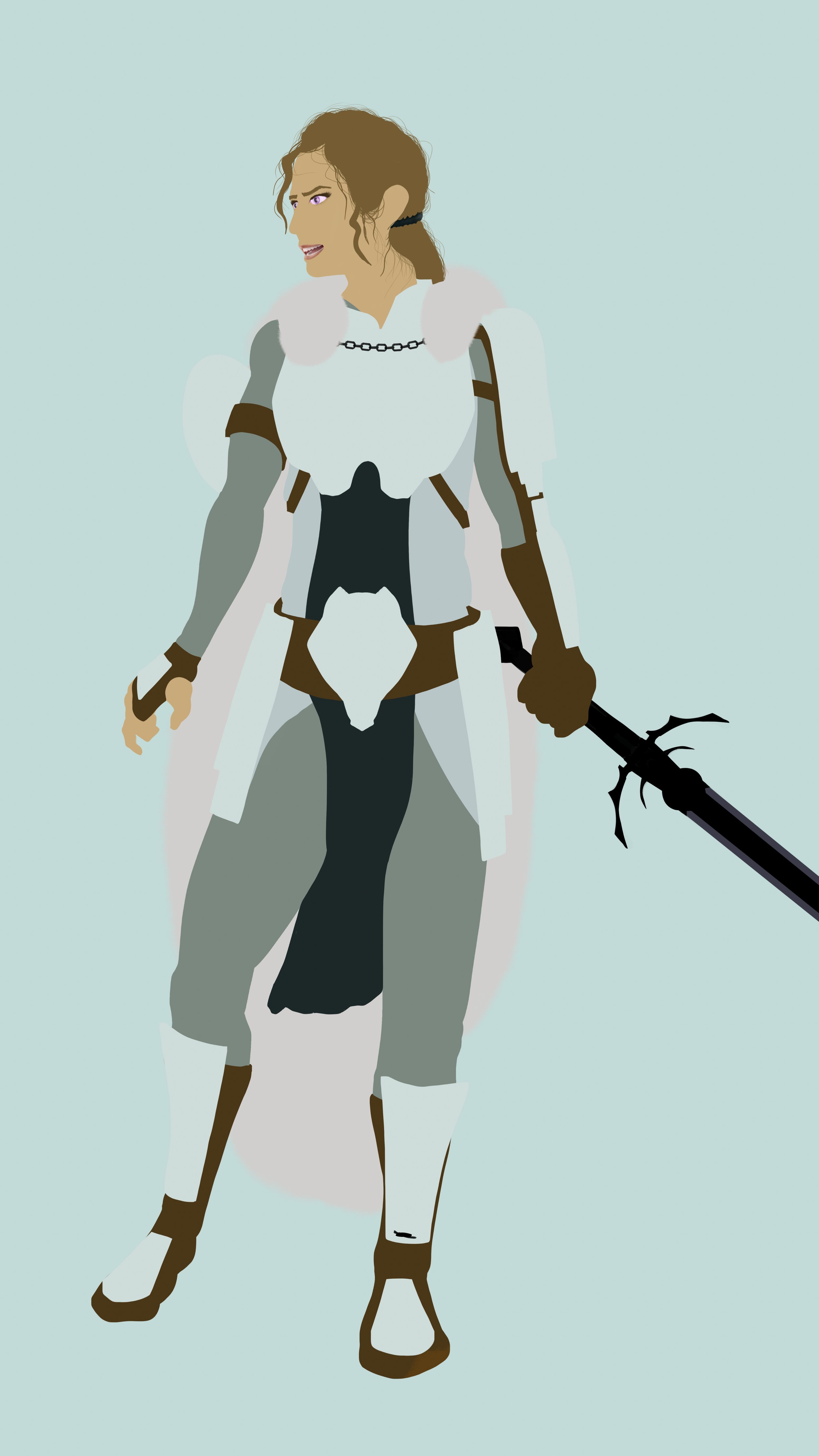
Moving forward I clean loose tags, and refine any rough shape edges. This is starting to look like a true warrior!

Initial Shading
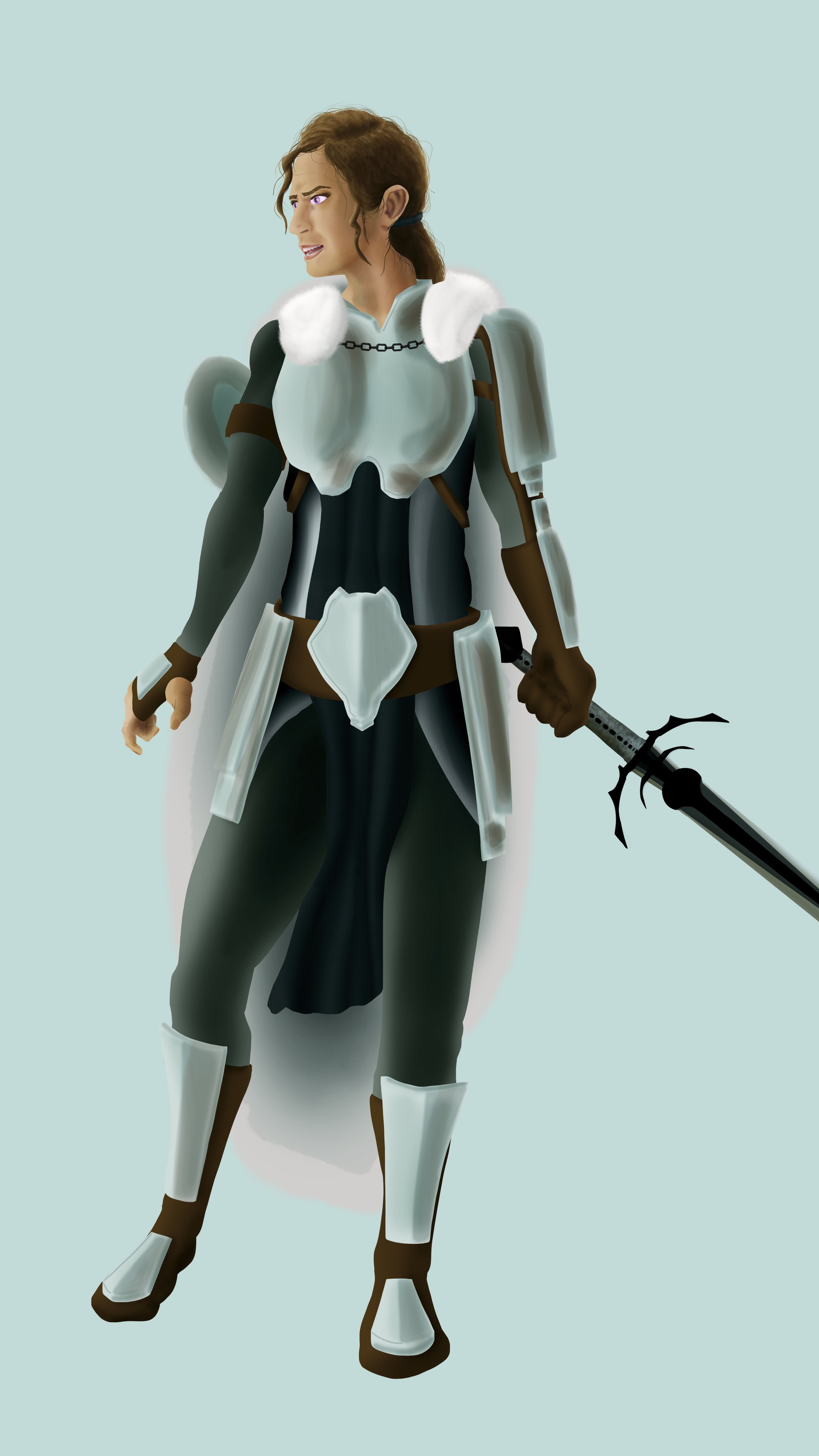
To bring into the more 3D realm, I incorporate under-painted shadows. She has to exist somewhere. Why not somewhere with a nice medium array of light behind her, at an angle. This can show our troubled hero amid troubling darkness within her, yet awash with the light around her.

Accenting Textures
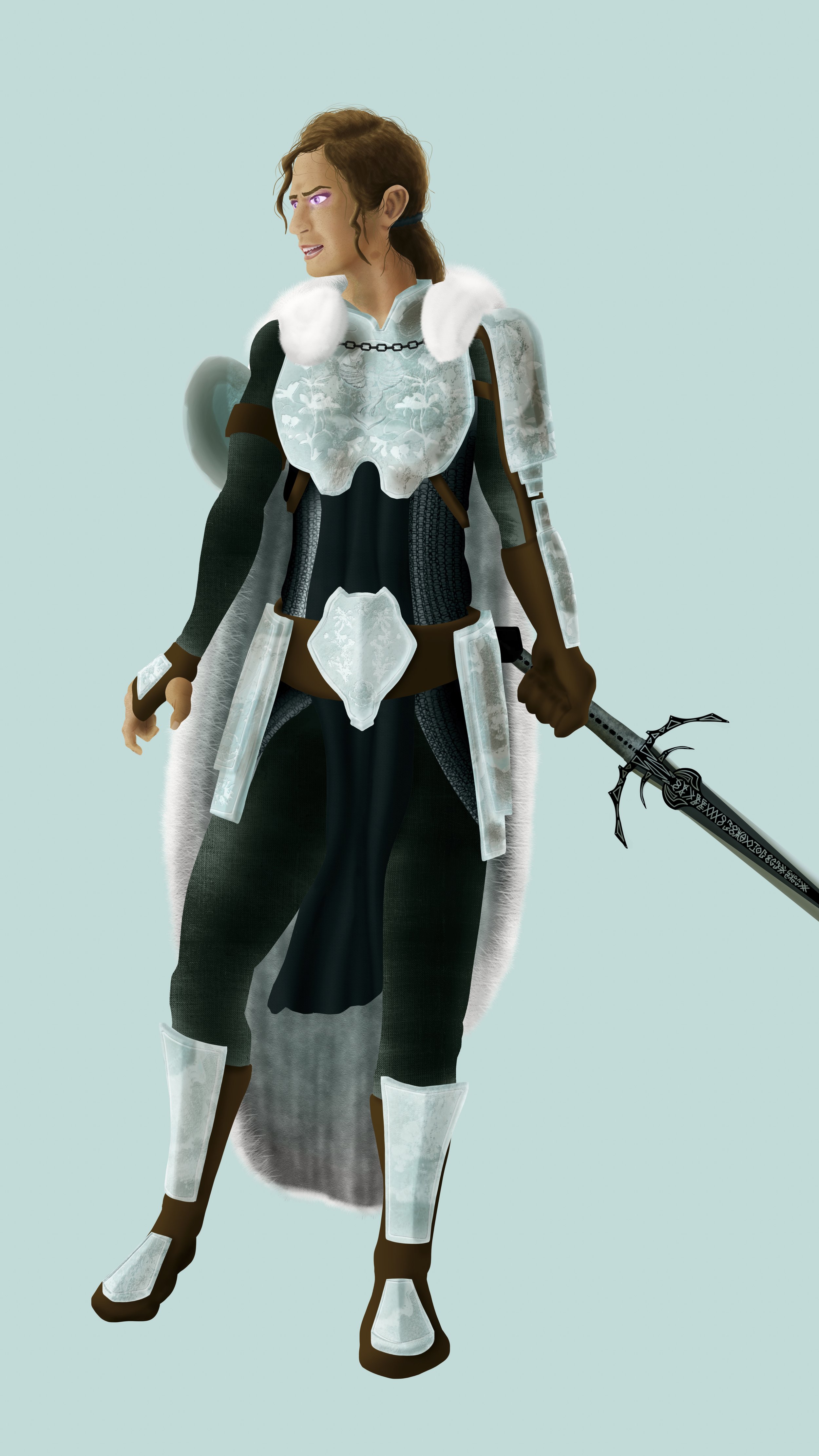
I add in detail and textures to main focal elements. Her armor in particular carry the rings of a chainmail underneath an ornate armor. This person is important. She can afford beautiful armor and weaponry. Her style is just as sharp as her blade. We can also dab in some magenta glow to her eyes for an air of mysticism

Accessorize
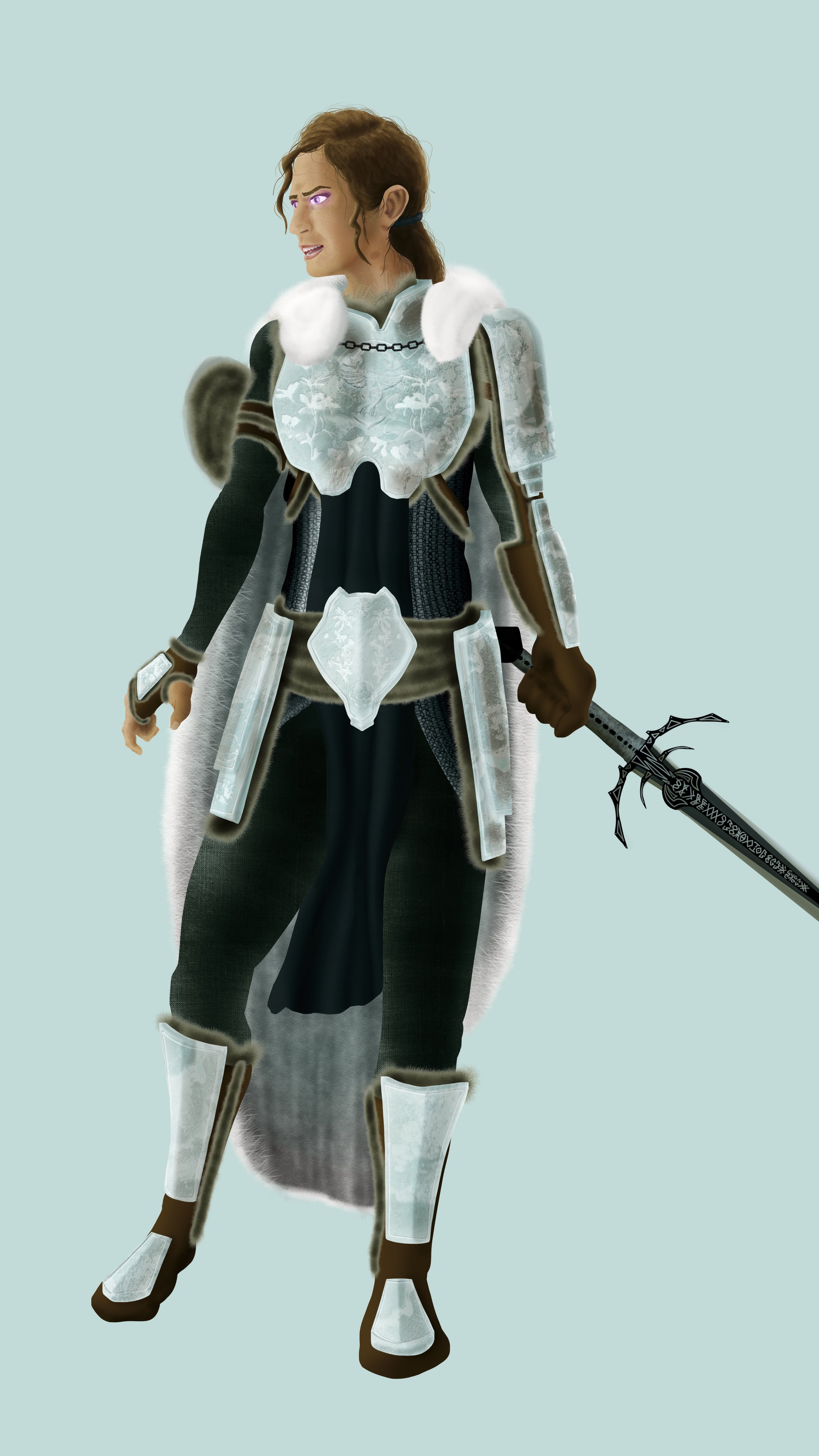
Next, I add in other supportive elements, and accessories to fill empty spaces. She wears a fur cloak. It would only make sense for her to line her clothes and armor in furs as well.

Background
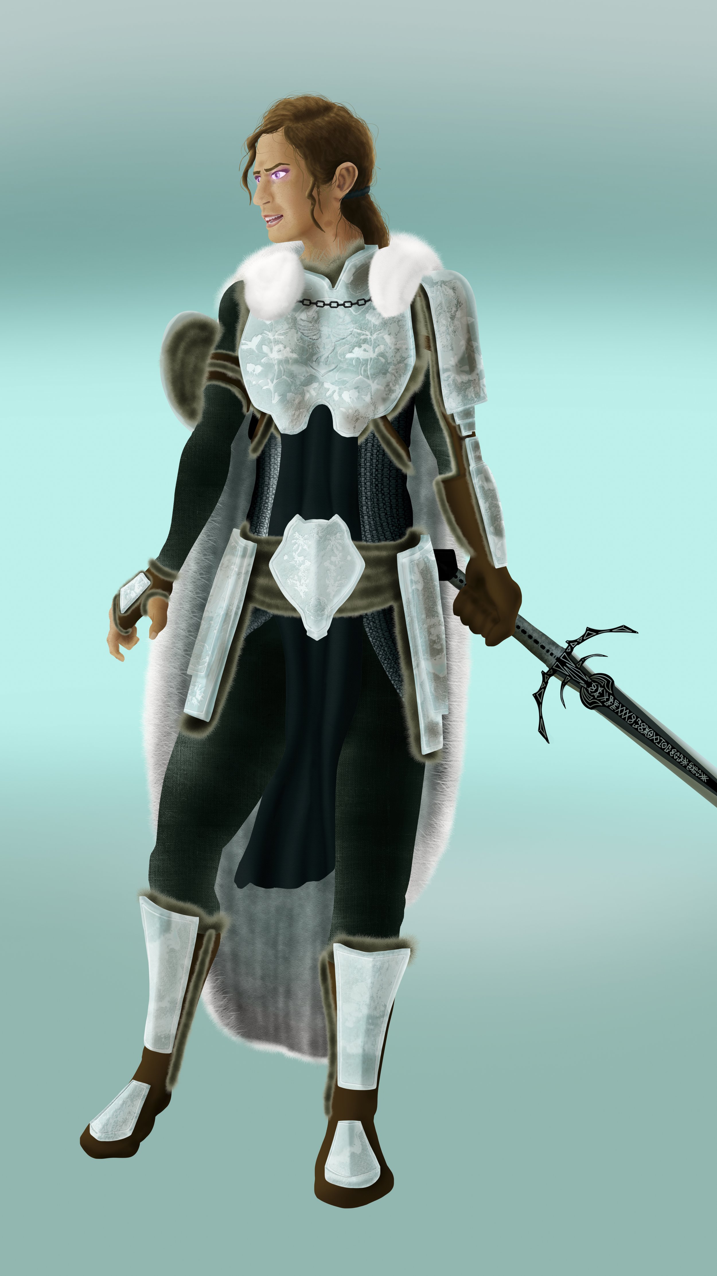
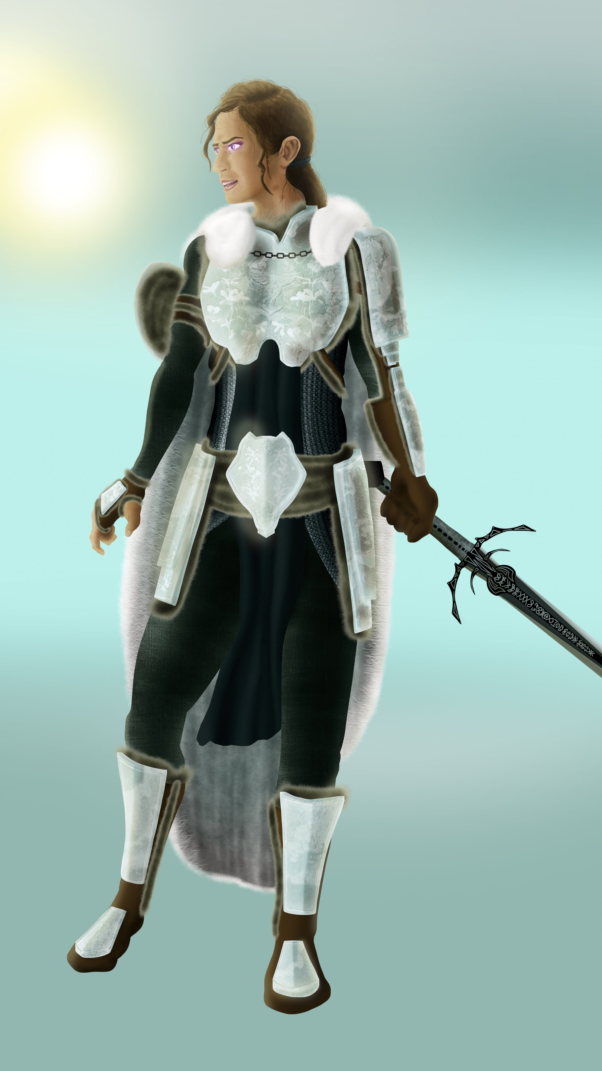
The second half to a full illustration. I want her face to be a main focus. A warrior in the wilderness demands to blend into their surroundings. Lets give gradual values to the background.

Initial lighting
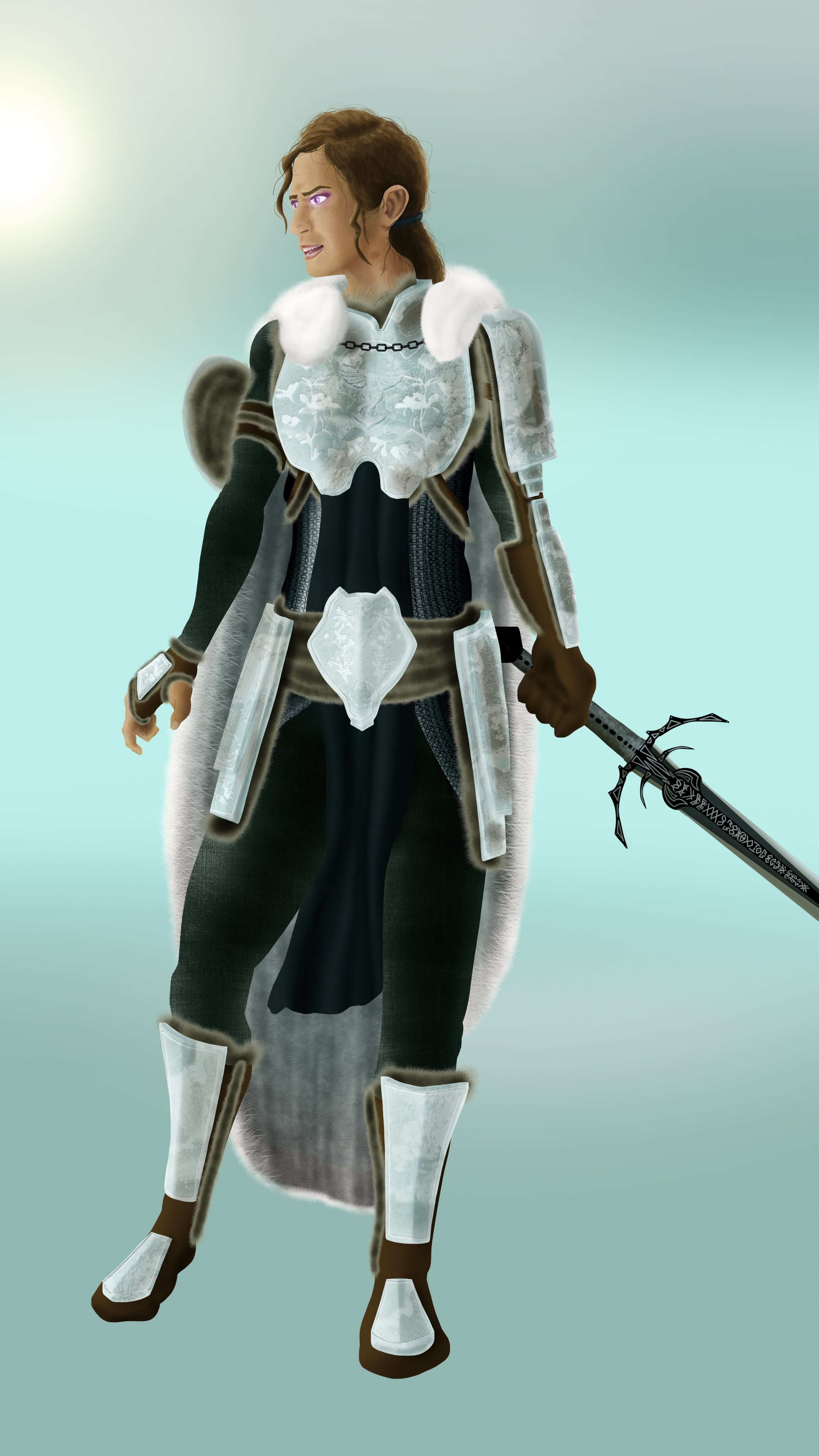
I place a source of light either onto or off the primary canvas to establish proper lighting angles. This helps me identify the source of light in the world.

Color Lighting
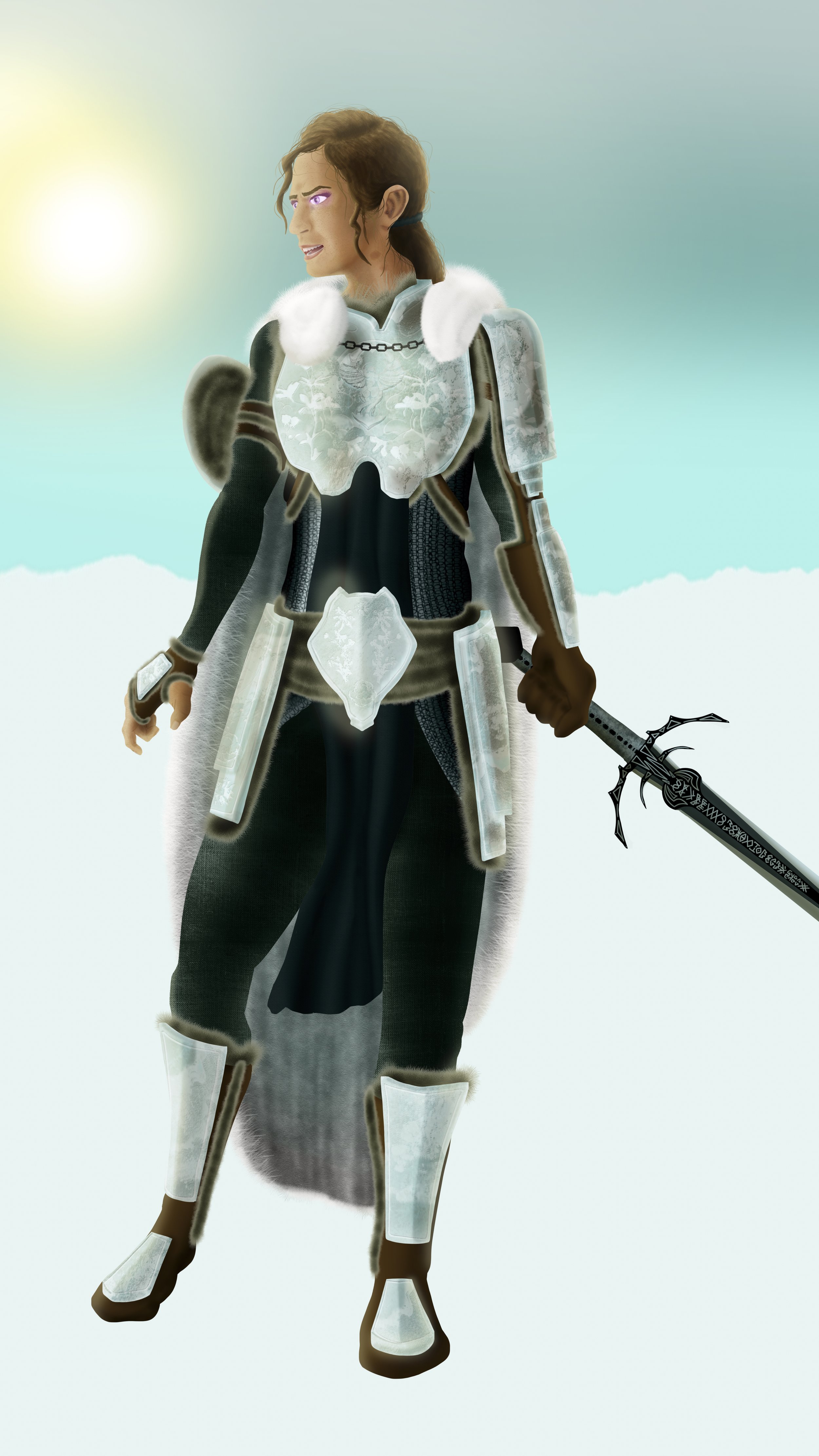
Adding in color to light and soft colored highlights allows the image to become that much more real. Lets set her stage in an open wild to tie her furry textures to more wild elements. With yellow sunlight, I can also take advantage of the soft magenta glow to her eyes, which can add in a small complementary contrast to pull our eyes.

Landscaping
Next I establish geographical and foundational features to the world we place our character. It must be cold if she’s wearing so much fur, so it must be a snow-covered tundra.

Background Detail
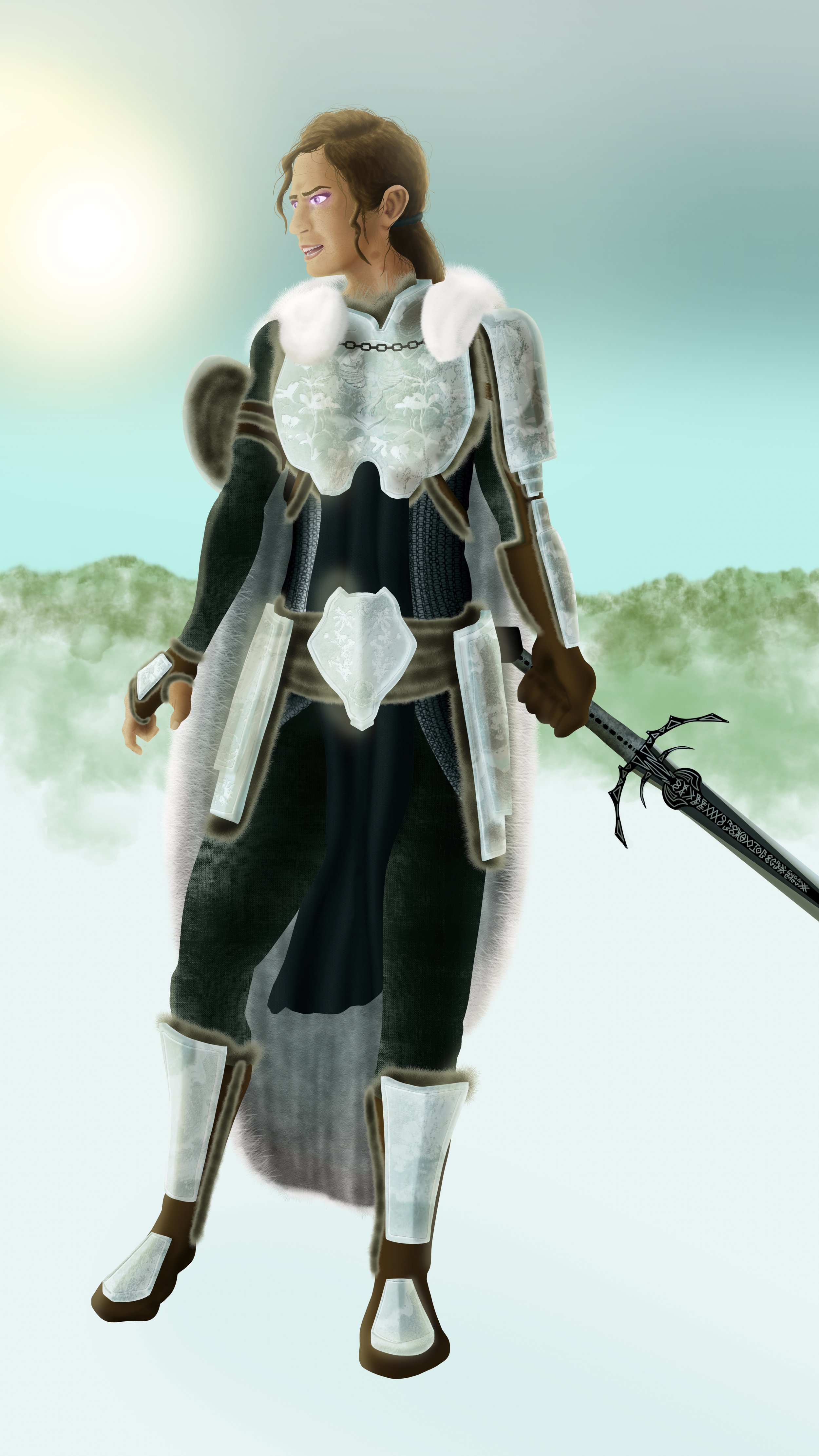
Next I incorporate large and loose shapes to overlay my background, before bluring it out of focus to establish distance. I utilize this stage to add in some other color to tie in split-complimentary elements.

Shadows
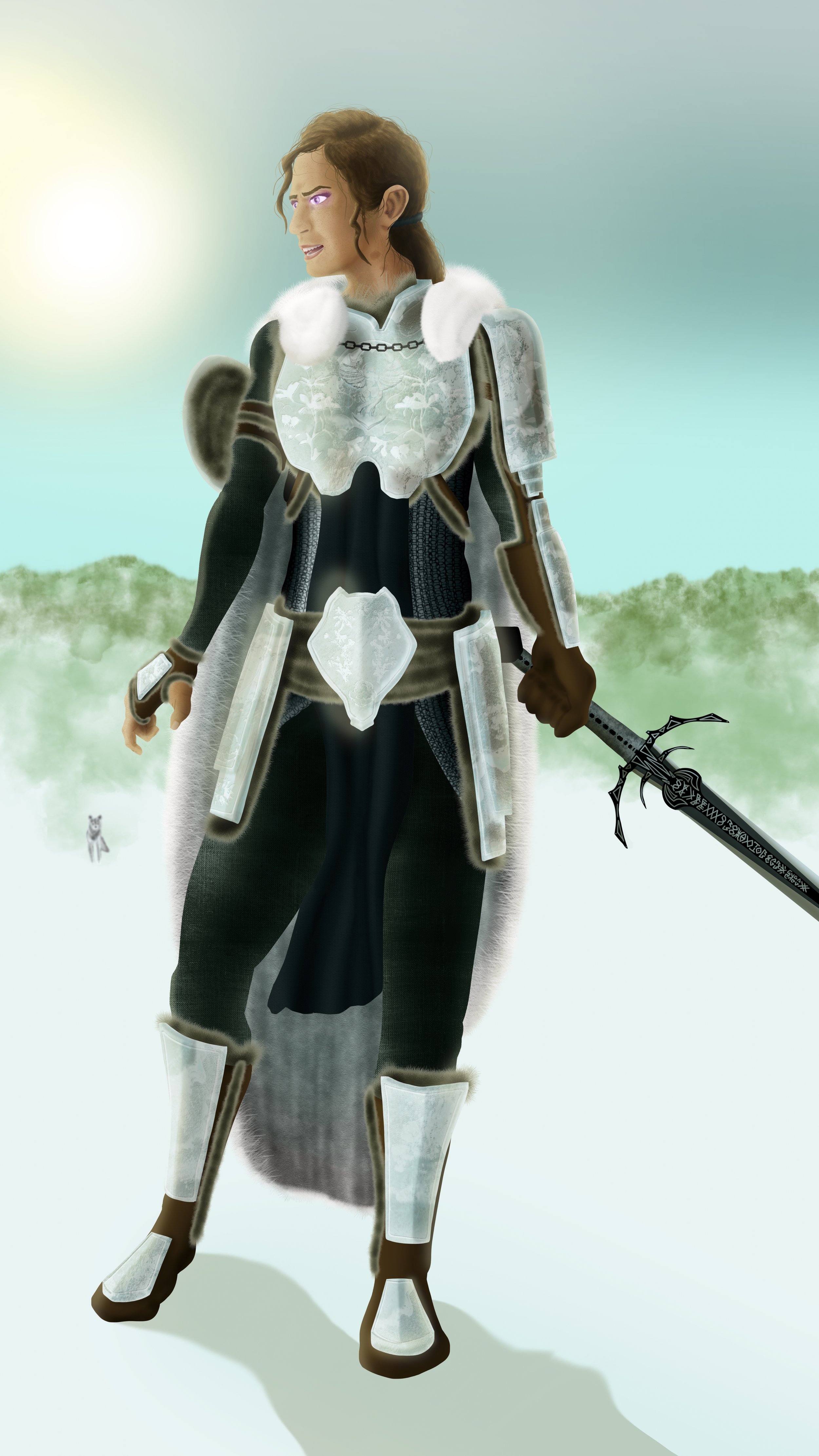
Shadows always help establish figure-ground relationships in geometric environments. Now that we have ground and distance, we can lay in some quick out of focus elements. Let’s add one lone wolf to reinforce our running theme. Since we also have established light, we can start placing hard shadows, too.

Foreground Detail
I add in foreground detail to help lead the viewer closer in the implied space. Flat ground is seldom interesting. Snow is often lain soft. We can still distort the ground by adding shadows which imply an uneven ground.

Midground features
To break up the distance between proximal distances for a believable range, I like to add in features between, so it doesn’t all look so empty. I opted to lay in dead and dry foliage for a land with little hope for survival.

Weather
It’s always worth considering external weather, even if you can’t readily see it in the open, there are still effects it would have on your world. Even soft and wispy clouds scattered by the winds of the flat lands, they are still there to texture the sky imperfectly.

Putting it all together
The last step, the most important step. Making sure it all fits and works together. We see now that our protagonist Aurora has stopped moving with near-bated breath for the next path of her journey.
